
CIVIC SAFETY | PUBLIC SECTOR
Making public safety data easy for all to access.
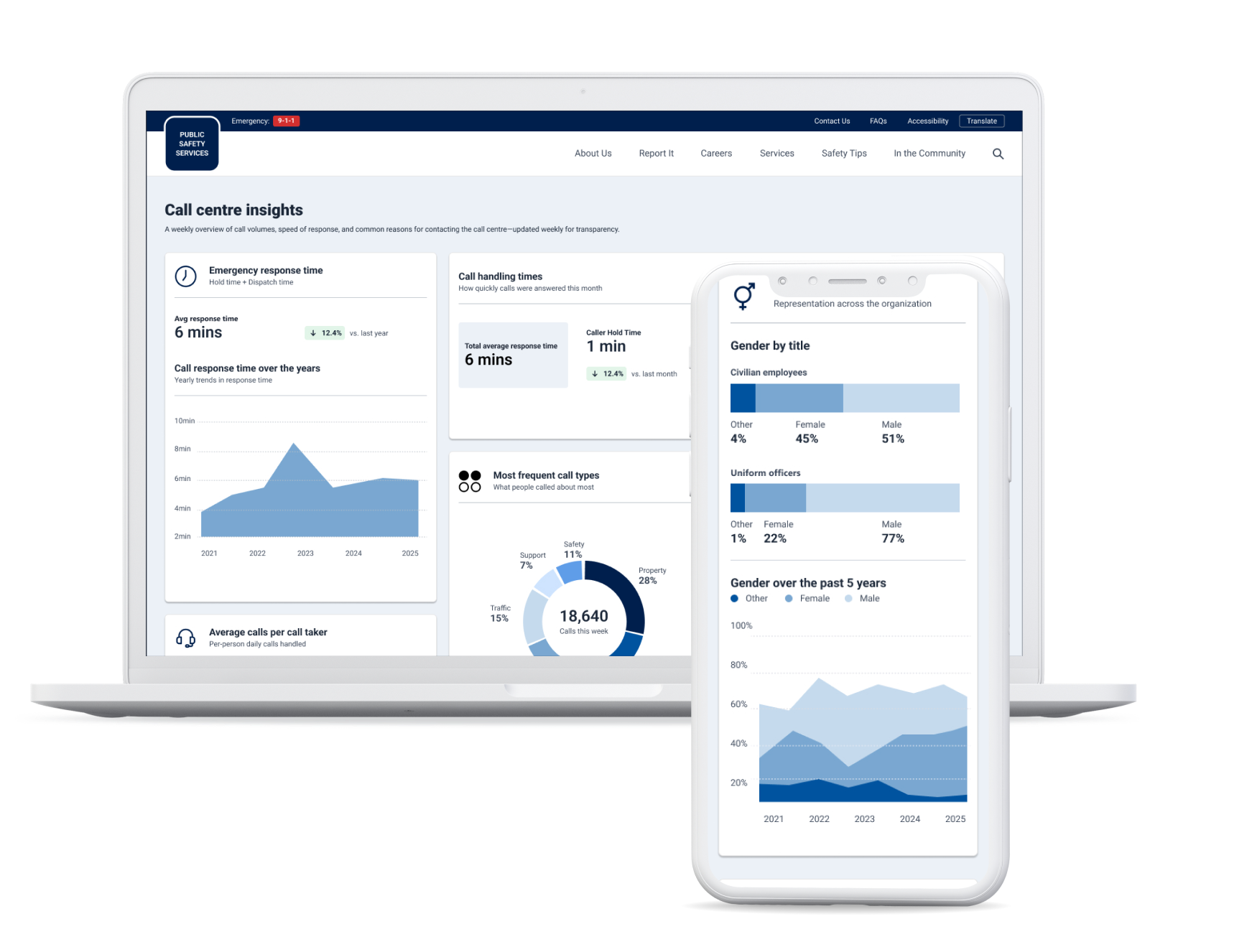
A set of public-facing dashboards that help the community understand incident trends, emergency response times, and the workforce that serves their community. Designed in three weeks, on a project that hadn't accounted for design at all.
Client details have been removed to protect client NDAs.
The Brief
Design was an afterthought, and I had three weeks to make it count.
The client wanted a unified space where residents could see what was happening in their region: how much crime was being reported, how quickly emergency calls were answered, and what the employee make up of the organization was. The dashboards would be built in Power BI as part of a larger data engagement, and the platform had to keep growing to accommodate new information updates.
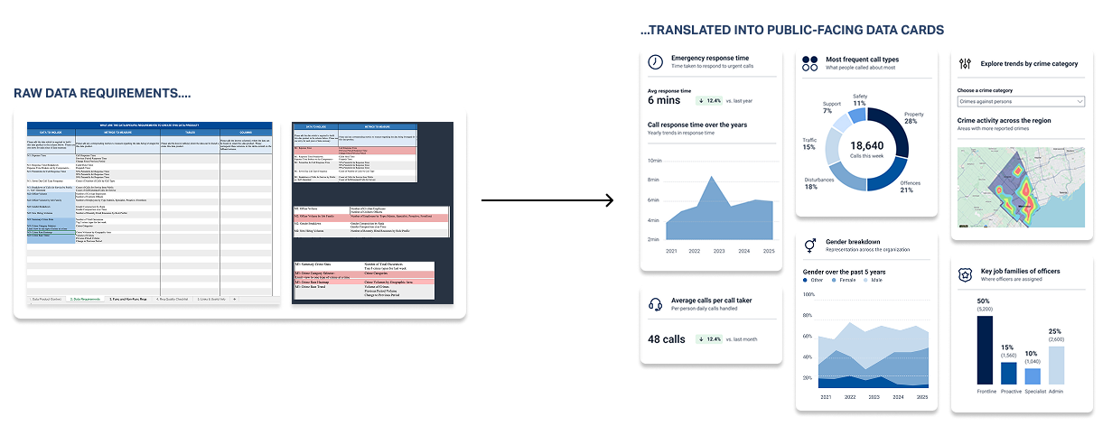
Late in the project, the team realized no one had accounted for designing the user experience. What existed was a requirements spreadsheet listing data and metrics. My job was to turn it into something the public could use, and something developers could build without me.
My role: Lead UX & Visual Designer
Platform: Microsoft Power BI
What I did: Requirements mapping, sketching, wireframing, stakeholder reviews, visual design, style guide for development handoff
Duration: 3 weeks

What was needed
Every metric had to make sense to the community.
The requirements listed each metric the way an analyst would: response time percentiles, calls for service by source, officer volume by job family. Few in the community would know what those terms mean. For each metric, I worked out what a resident would actually want to know, then designed the card around that answer.
A few decisions carried across all three dashboards:
01/ Plain language on every card.
Every chart has a one-line description under its title, so residents know what they're looking at before reading the numbers.
02/ Clear indicators to mark changes
To enhance accessibility, changes are highlighted not just through colour but with labels and arrows too.
03/ Filters preselected on page load.
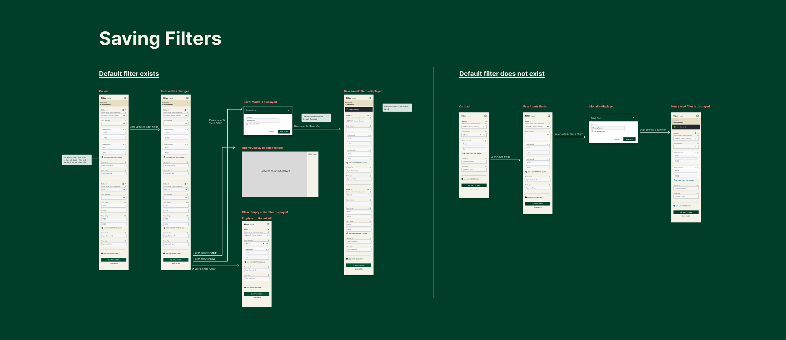
Category filters load with the first option already selected, so people land on real data and the charts are never blank.
04/ Mobile friendly design.
Many residents will check this on their phones, so cards stack in priority order, with the key figures first.

The Process
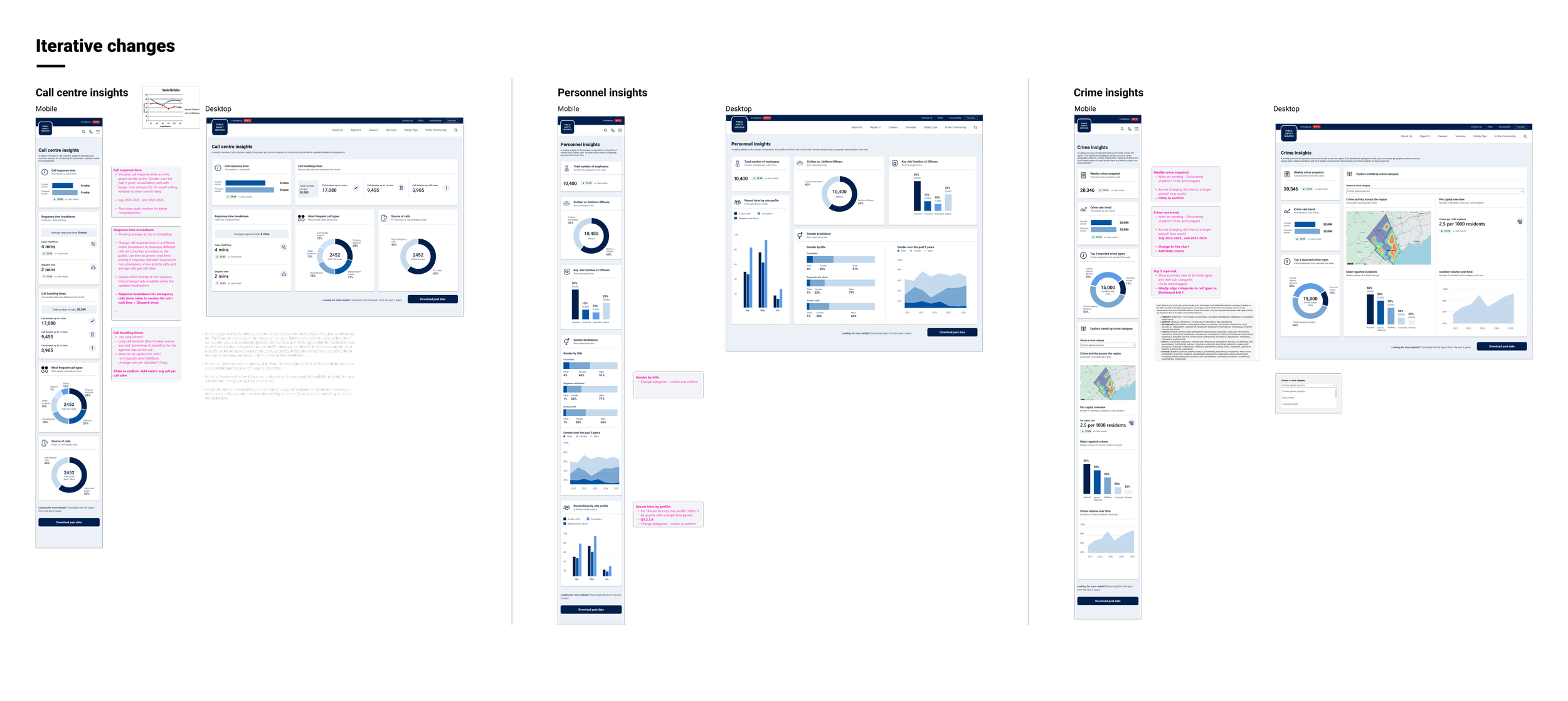
Eight rounds of iteration in three weeks.
Given the tight timelines, waiting days for feedback wasn't an option. To keep things moving, I set up daily half-hour syncs with stakeholders. These power syncs gave the project a steady rhythm, so feedback that might otherwise have taken days came back within hours.
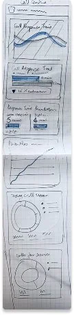
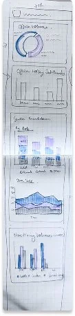
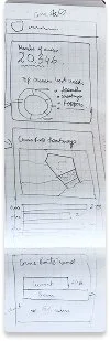
That rhythm carried the work from hand sketches through wireframes, visual design and the final handoff, in eight rounds. Because decisions were made every day, nothing piled up and open questions were settled early on.
The Work
Three dashboards that build transparency with the community.
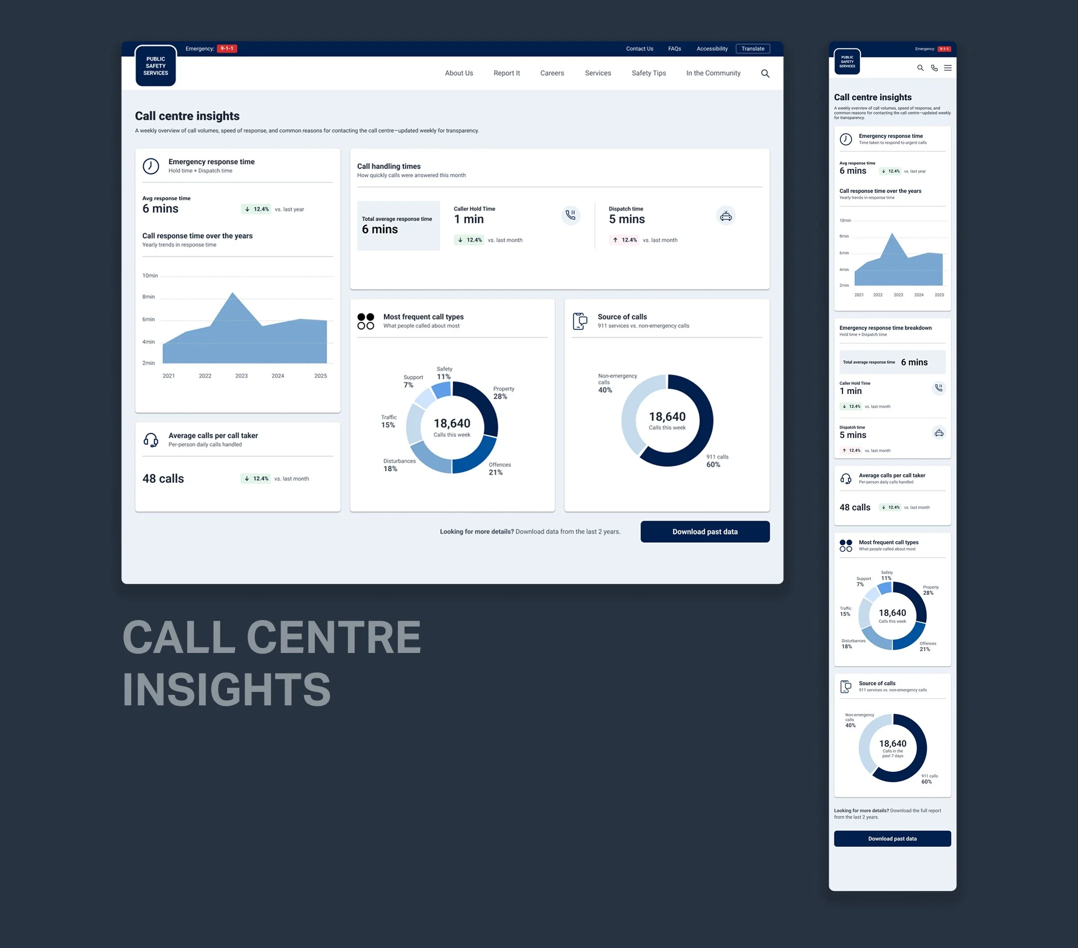
Call centre insights: Emergency response time broken into hold time and dispatch time, plus call volumes, the most common reasons people call, and where calls come from.
Incident insights: Reported crime by category, five-year trends, and a filter to explore one category at a time: where it's happening, the rate per 1,000 residents, and the most reported incident types.
Personnel insights: Headcount, civilian staff versus uniformed officers, job families, gender representation over time, and recent hiring.

Where it landed
Designs for this phase are being built and piloted, laying the foundation for more consistent, system-supported decision-making as the platform evolves.
While this project is a part of a much larger multi-year rollout, the initial phases changed how yard conditions are understood and discussed. Instead of piecing information together across systems, teams can start from a shared, up-to-date view of what’s coming into the yard and what needs attention right now. Conditions like congestion, risk, and readiness are surfaced earlier, making prioritization clearer and conversations more focused.
Reflections
AI accelerated my learning curve and delivery time
Railways is a layered, complex industry, not easily understood by an outsider. AI became my always-available subject matter expert, helping me get up to speed in days rather than weeks. That same approach carried into delivery: using AI to synthesise research findings cut that time in half, leaving more room for the design work itself.
‘Day in the life’ studies brought up the right challenges
Spending time in the rail yards, shadowing operators through their work day surfaced challenges that wouldn't have shown up in a requirements document. It helped the team focus on the problems that actually mattered, the ones that slowed people down, created risk during handovers, and made experienced users reluctant to change.
The key question was what to design first
On a large team with multiple stakeholders, everyone had a different idea of where Phase 1 should start. Aligning on MVP criteria took time we hadn't planned for. The learning I'd take forward is to get explicit agreement on scope and priorities before design starts, not alongside it. It's a conversation worth having early, even when it feels premature.