
RAILWAY OPERATIONS I TRANSPORTATION
Helping freight rail teams make faster, safer decisions.
In partnership with a large freight rail operator, this work helps teams running busy freight yards make fast, confident decisions when conditions are constantly changing - bringing clarity to what trains are coming into the yard and what needs attention next.
Company name has been fictionalized to protect client NDA
Problem Overview
Running one of North America’s busiest freight networks with old-school DOS-style technology.
Freight rail yards are massive industrial hubs where trains are sorted and dispatched across the country. The teams running them make high-stakes, real-time decisions all day. They decide which trains to prioritize, where bottlenecks are forming, what needs attention now versus later.
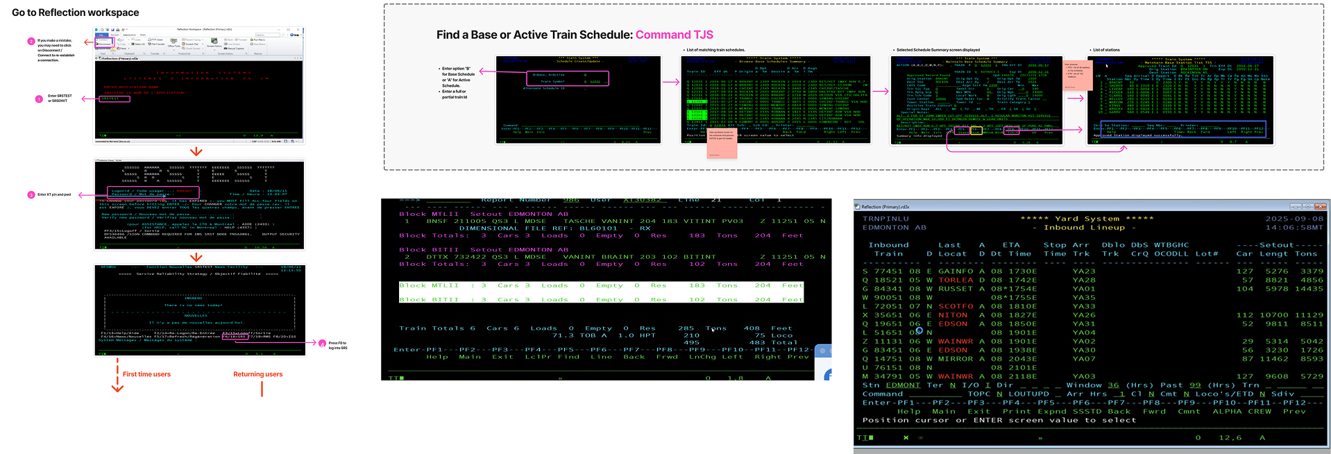
The client, a major North American freight rail operator, was making these decisions using command-line terminals from the past. They were dealing with an outdated interface, text-heavy black screens, no visual hierarchy, and no clear error states. Users navigated just by memorizing commands. That knowledge lived in people's heads, but was not documented in the system.
The client was undertaking a major modernization initiative to move its operations onto a modern platform ; a multi-year programme spanning multiple work streams. The Yard Management module was deliberately designed first, to deliver early, tangible value while the larger transformation was still getting underway.
My role & responsibilities
Lead UX Designer
I was brought in as part of a cross-functional team for Phase 1 of the project.
I ran discovery sessions with stakeholders to reverse-engineer the logic of a system that had never been fully documented, designed across a highly complex operational environment, managed the Phase 1 design and development handoff, and took ownership of the design work stream.
Duration
4 months
DOS-Style old systems that needed to be modernized

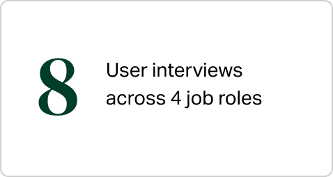
What primary research showed us
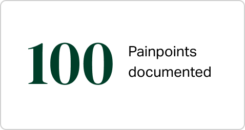
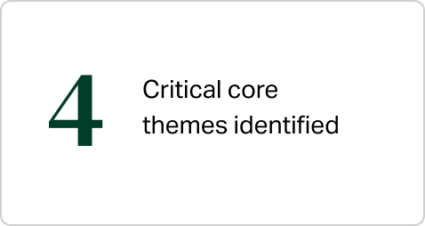
01/ Information for a single action split across multiple systems
Users juggled between up to 4 screens simultaneously just to complete one task, increasing time taken for a single action.
02/ Constant switching led to lost context and increased chance of errors
There was no easy way to move between views - users could lose context while switching, and this increased the chance of errors
03/ Experienced users were resistant and fearful of change
Years of building muscle memory around the old system had made some users very comfortable, and adoption of anything new wasn't guaranteed
04/ Lack of standardization while completing a task
The same task was done differently by different people, creating operational risk during shift handovers
Key Design Question
How might we design so that first-time users can feel as confident as experienced users, without making experienced users feel like they've lost something familiar?
“
I’m used to the old system, and I’m worried about it being replaced by something new
- Yard Coordinator (excerpt from interview)
”
Discovery Sessions
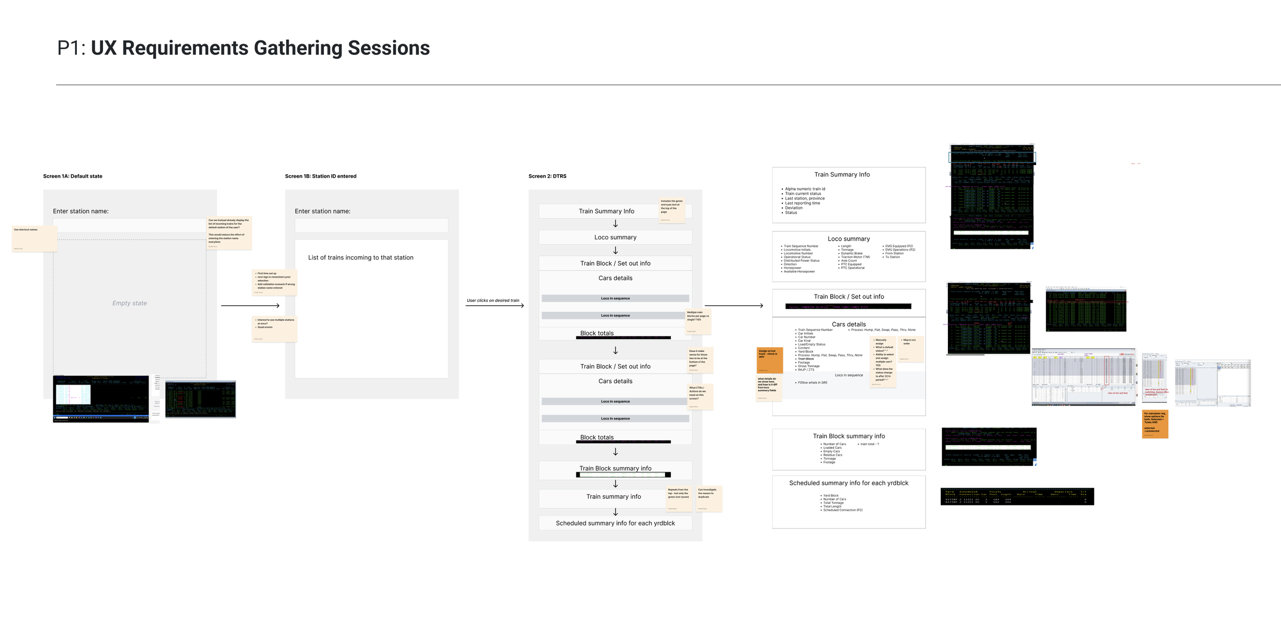
Before jumping into design, I aligned stakeholders on what we are designing for.
Before any wireframes, I ran structured working sessions with stakeholders to map the legacy system's logic to the new interface - field by field, screen by screen. The legacy system had approximately 7,000 lines of code that had never been fully documented.
I surfaced questions that were critical to the redesign:
How does the journey look for first-time users vs. returning users?
What is the most important information the user needs visibility on right away?
What information can we do away with, or disclose progressively to reduce mental fatigue?
What familiar elements from the legacy system should we retain, to foster a smoother transition ?
The working documents from these sessions helped shape product decisions.
The Work
Section 1: Inbound Train Lineup + Train Details Screens
Giving operators a clear picture of what’s incoming, even before their shift starts.
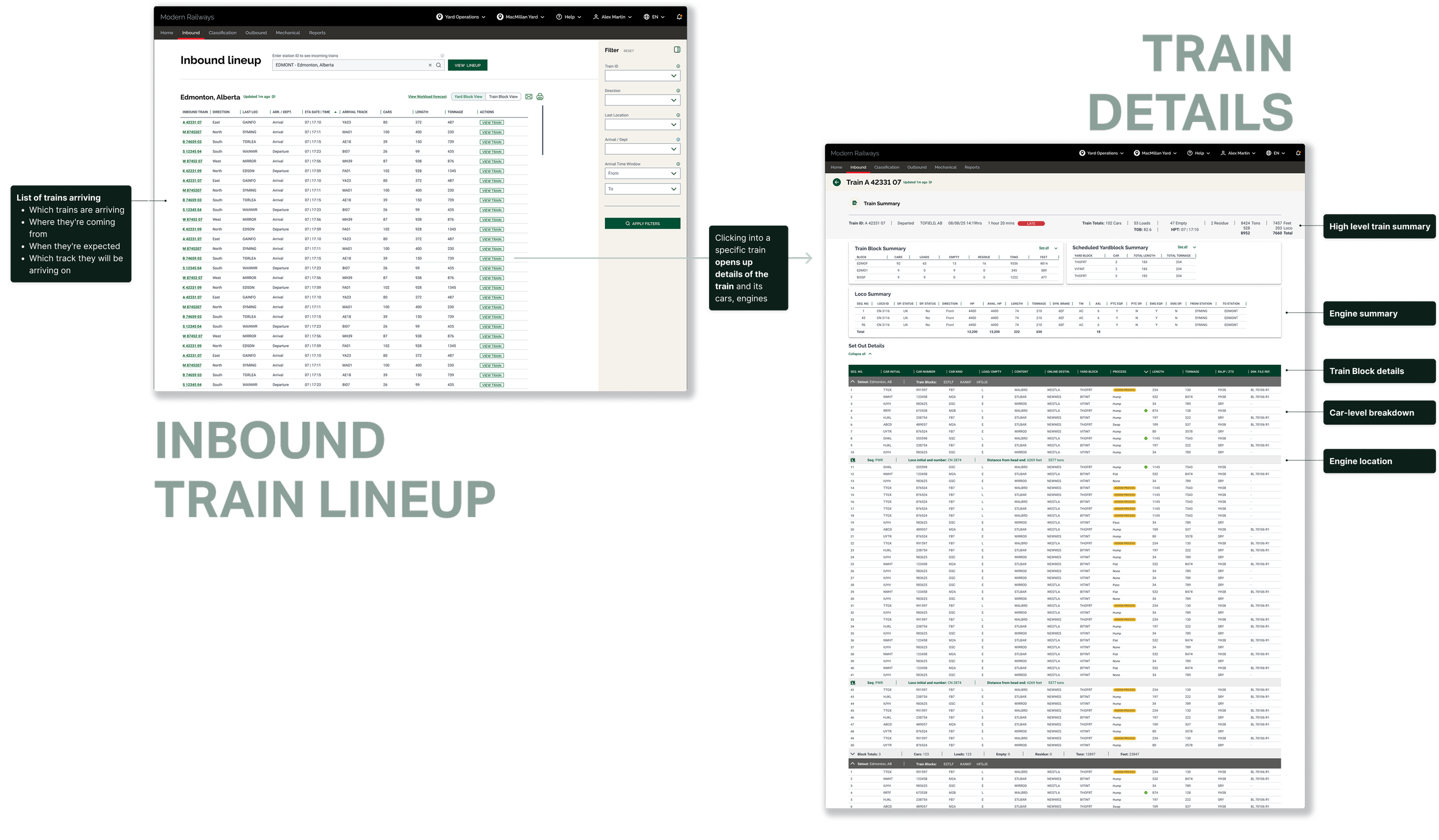
The Train Lineup Screen is the starting point for yard staff at the beginning of a shift. It gives teams a clear, forward-looking picture of trains headed into the yard.
Redesigning this screen needed to account for:
· Which trains are arriving
· Where they're coming from
· When they're expected
· Which track they will be arriving on
From here, a single click takes teams into Train Details Screen.
This view is designed for fast scanning and prioritization, helping teams anticipate pressure and plan ahead, rather than reacting once trains are already on the ground.
Redesigning this screen needed to show:
· Train summary at a high level
· Engine details
· Train block details, and car-level breakdown
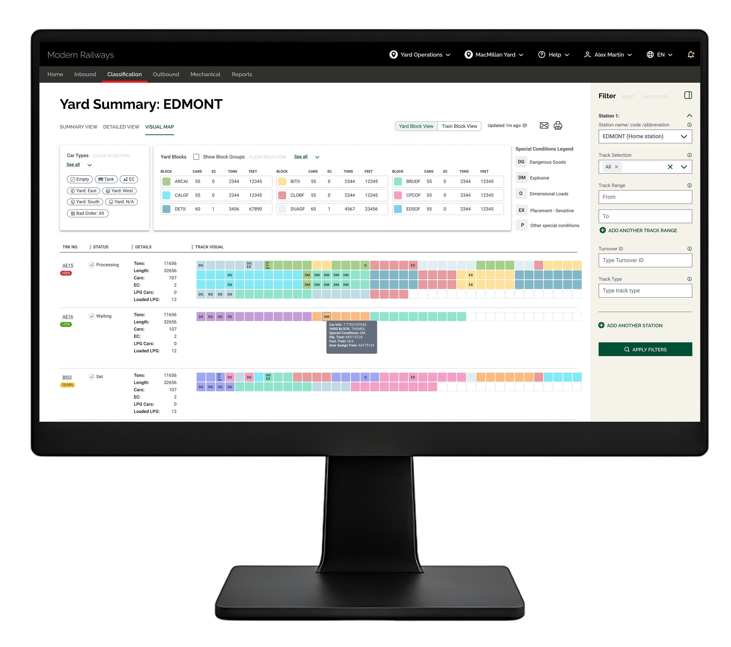
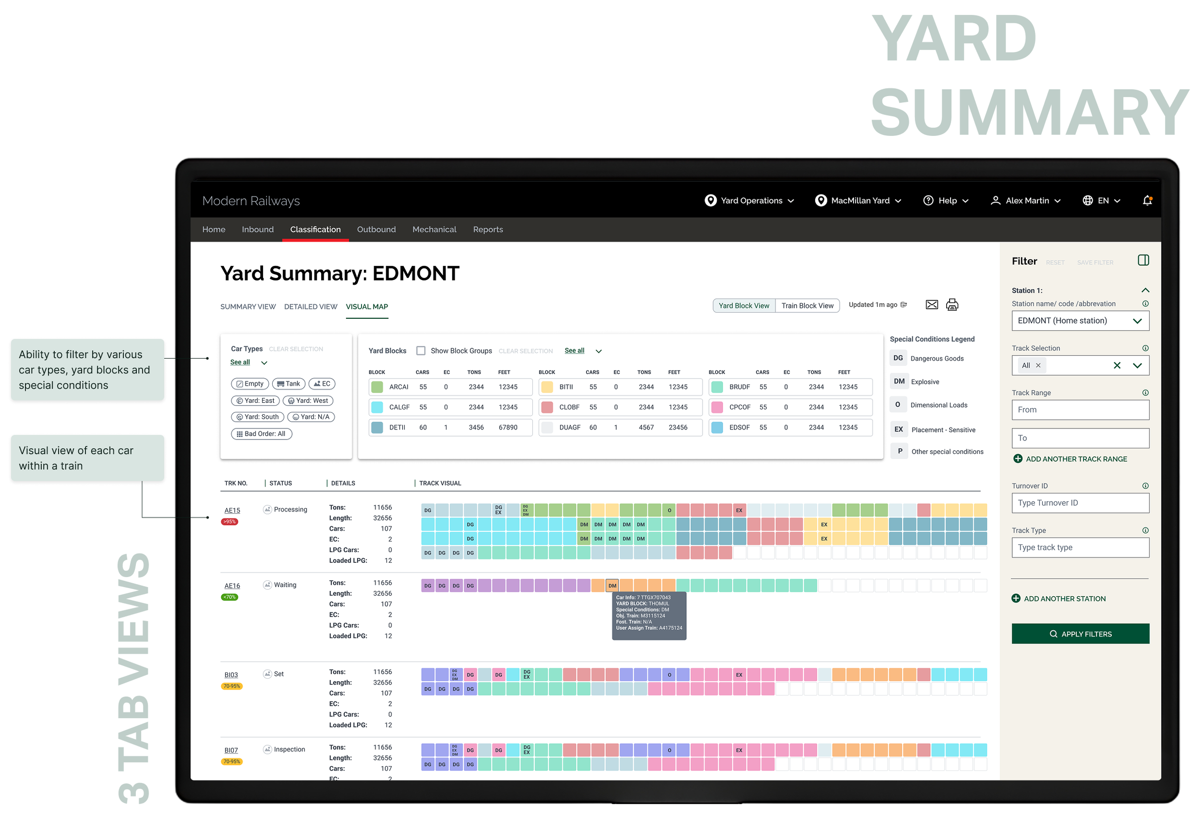
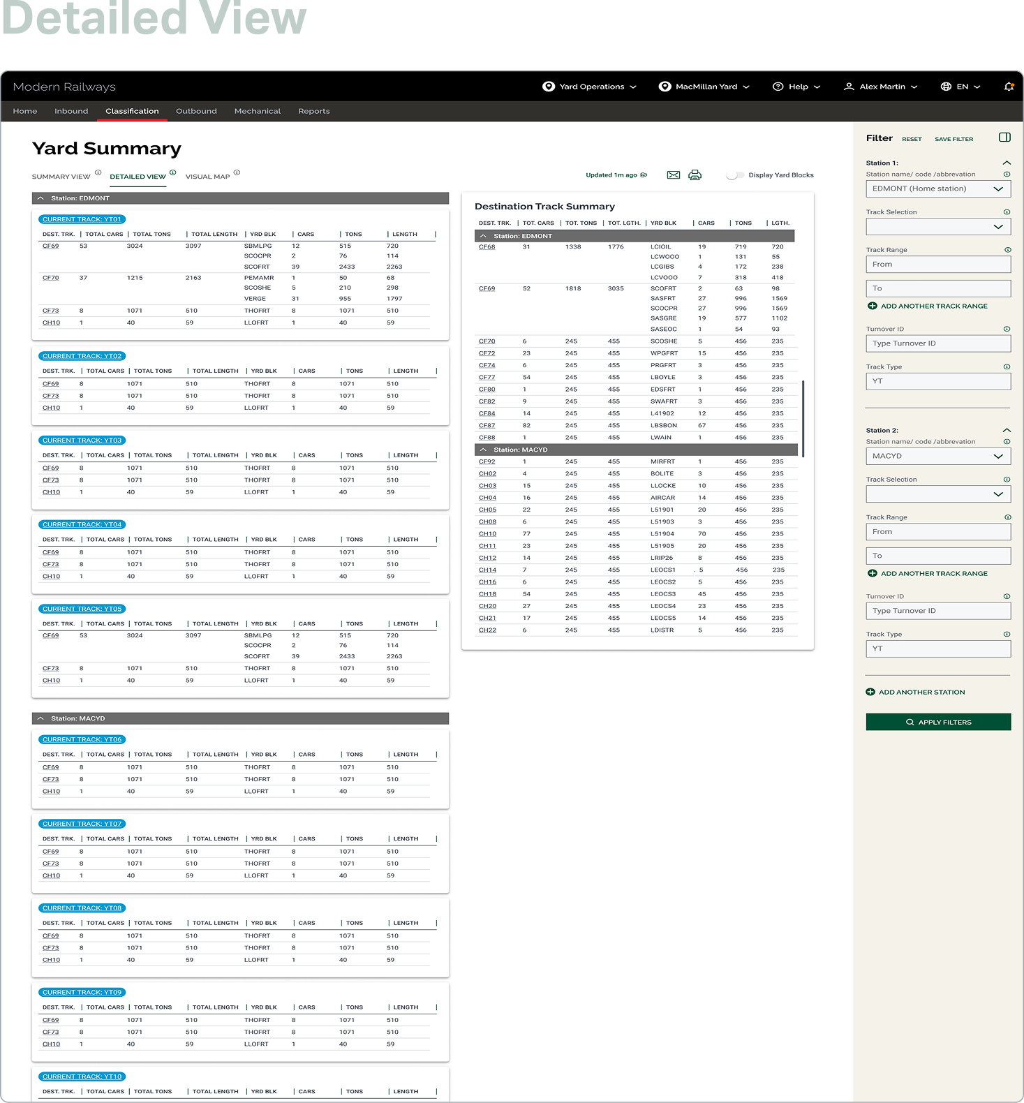
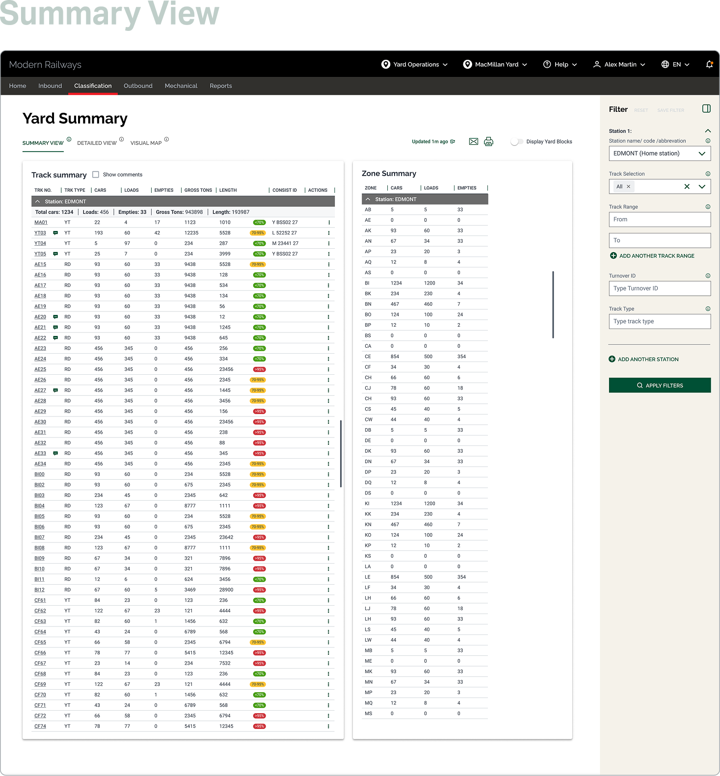
Section 2: Yard Summary Screens
Giving operators a clear picture of the state of the yard
Once trains are on the ground, teams need to understand the current state of the yard.
Which tracks are filling up?
What's ready to move?
Where are risks or constraints starting to build?
The yard summary view makes these conditions visible at a glance.
Instead of scanning long tables or cross-referencing systems, teams can quickly see:
· How cars are distributed across tracks
· Where hazardous, residue, or inspection-required cars are concentrated
· Which areas are flowing smoothly versus getting blocked
Teams can drill into details when needed-confirming inspection status, car type, or destination - without losing sight of the overall yard. This supports clearer prioritization, better risk management, and steadier yard flow.
Filtering Capabilities
Giving operators the ability to zoom in and out of large datasets
Operators are constantly dealing with a large influx of information. At times they need a macro view of all the trains in the yard, while at other times they need to drill into the details of a specific car within a single train. The same screen has to serve both needs
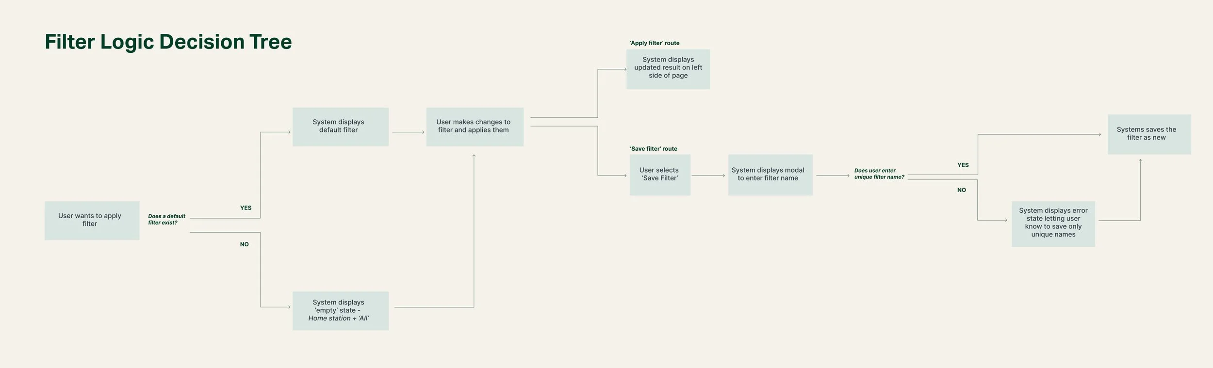
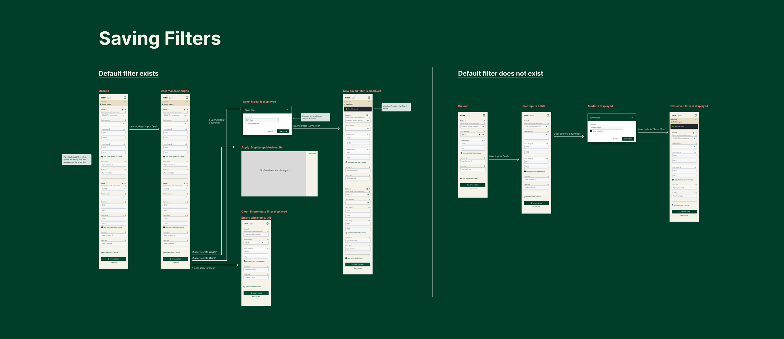
Filters are how we handled that range. But the complexity here was significant. Operators work across multiple stations, track ranges, turnover IDs, and track types simultaneously. Therefore a filter has to be a highly configured view of a specific slice of the yard, built around how a particular person does their job.
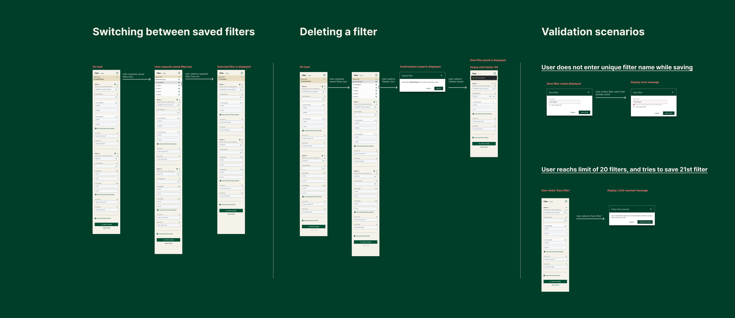
To ensure an operator’s most used configurations are always one tap away, I designed a system that allows for:
· Saving filters
· Setting a filter as default
· Switching between saved filters
· Deleting filters
Where it landed
Designs for this phase are being built and piloted, laying the foundation for more consistent, system-supported decision-making as the platform evolves.
While this project is a part of a much larger multi-year rollout, the initial phases changed how yard conditions are understood and discussed. Instead of piecing information together across systems, teams can start from a shared, up-to-date view of what’s coming into the yard and what needs attention right now. Conditions like congestion, risk, and readiness are surfaced earlier, making prioritization clearer and conversations more focused.
Reflections
AI accelerated my learning curve and delivery time
Railways is a layered, complex industry, not easily understood by an outsider. AI became my always-available subject matter expert, helping me get up to speed in days rather than weeks. That same approach carried into delivery: using AI to synthesise research findings cut that time in half, leaving more room for the design work itself.
‘Day in the life’ studies brought up the right challenges
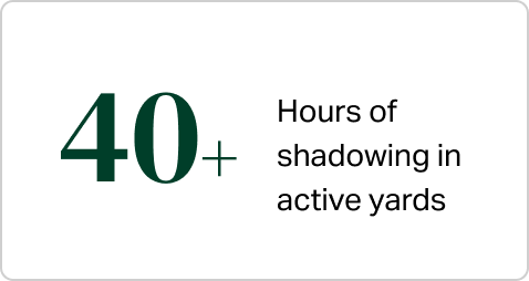
Spending time in the rail yards, shadowing operators through their work day surfaced challenges that wouldn't have shown up in a requirements document. It helped the team focus on the problems that actually mattered, the ones that slowed people down, created risk during handovers, and made experienced users reluctant to change.
The key question was what to design first
On a large team with multiple stakeholders, everyone had a different idea of where Phase 1 should start. Aligning on MVP criteria took time we hadn't planned for. The learning I'd take forward is to get explicit agreement on scope and priorities before design starts, not alongside it. It's a conversation worth having early, even when it feels premature.