
INSURANCE | FINANCIAL SERVICES
Taking control of your insurance, made easy.
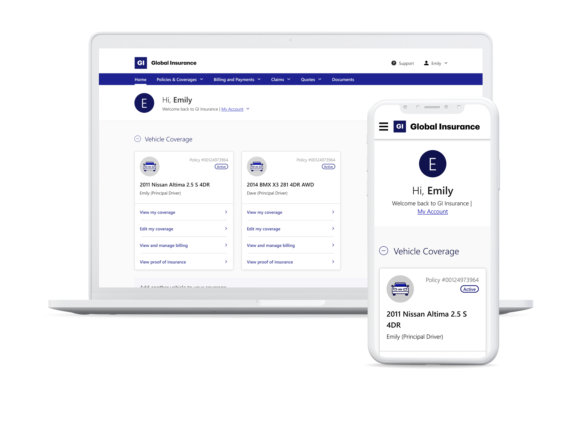
A transformed and intuitive dashboard, designed to give customers control over their insurance plans, minimize confusion, and reduce the need for support calls.
Company name has been fictionalized to protect client NDAs.
Problem Overview
A confusing self-service portal that drove customers to call for help.
The existing digital portal of a leading Canadian insurer was supposed to enable more customers to independently manage their insurance plans online. Customers, however, found the old dashboard confusing to navigate, and didn’t feel confident managing their policies online. Tasks were scattered across screens with no navigational thread between them, dense detail instead of clear action, and long policy numbers instead of easily recognizable vehicle names. Customers who came in to do something simple - check their coverage, find a document - frequently couldn't complete it without calling the phone support channel for help.
The business needed to shift more transactions online and reduce the burden on the customer support channel. To that end, they were looking to redesign the dashboard to give customers a more personalized, intuitive experience where they can easily find what they're looking for and feel confident in taking charge of their coverage.
My role & responsibilities
Lead UX Designer
Strategy & planning, workshop facilitation, cross-functional stakeholder management, information architecture, user journey mapping, design reviews, wireframes for dev handoff
Duration
8 months

What made this hard
The real problem was unwanted complexity and misplaced trust
While the initial brief framed this as just a way finding problem, early research challenged that. The harder problem was that customers didn't trust the portal to help them. They came in to complete a task, couldn't quickly confirm they were in the right place, and abandoned - or called in for help instead.
Just redesigning navigation wasn't going to fix that. The design had to rebuild confidence from the first screen, and do it within the constraints of a legacy back end that hadn't been built with self-service in mind.
Key design question: How do we design a portal that customers trust enough to use on their own, instead of feeling the need to call in for help?
What we delivered
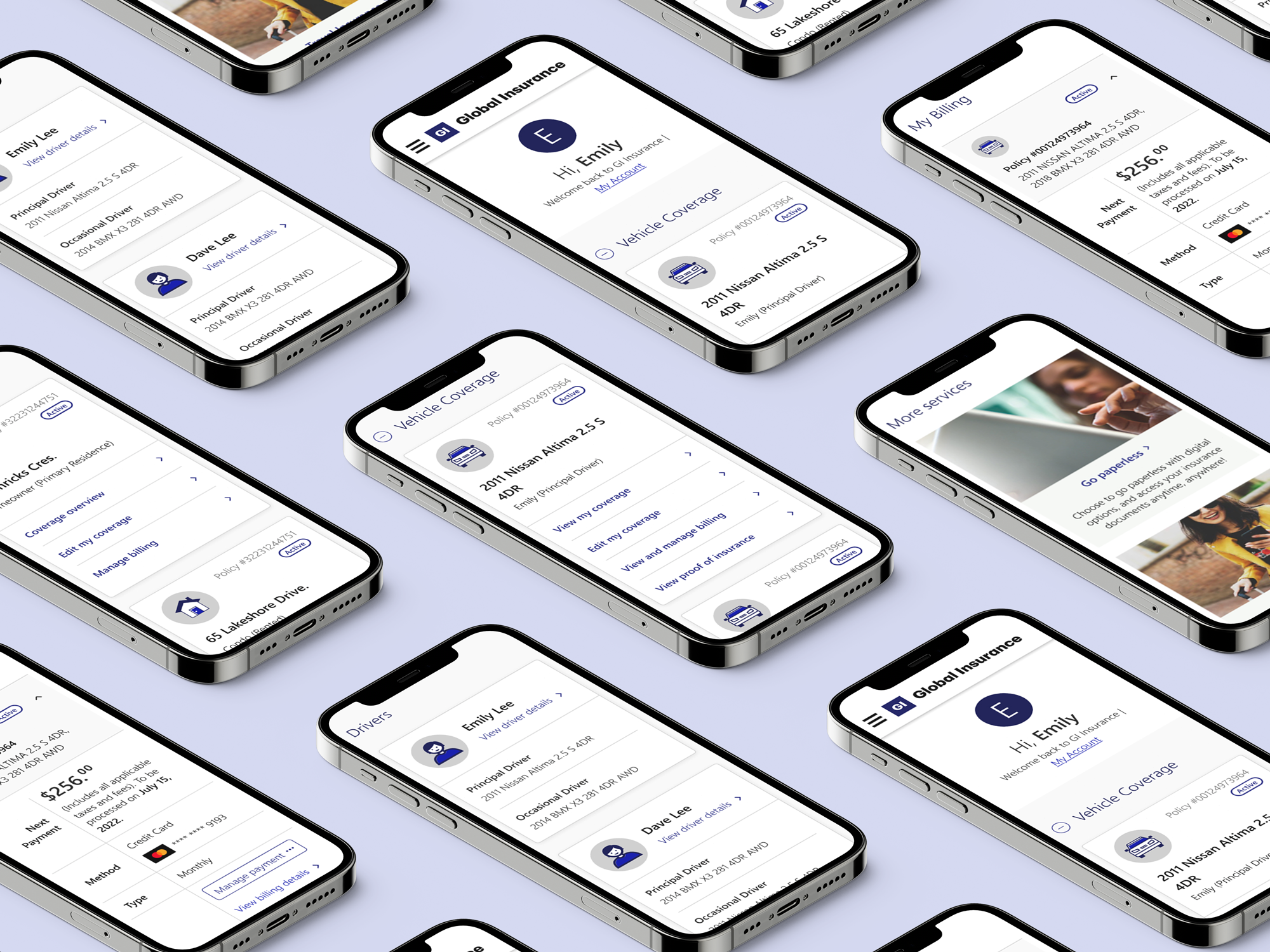
A redesigned dashboard organized around how customers think about their insurance.
Post-launch metrics of the redesigned dashboard showed immediate impact:
17% increase in digital share, i.e. transactions completed online, thereby reducing reliance on support channels.
35% increase in login rate, reflecting higher user engagement
20% increase in registration rate, demonstrating improved customer adoption and confidence
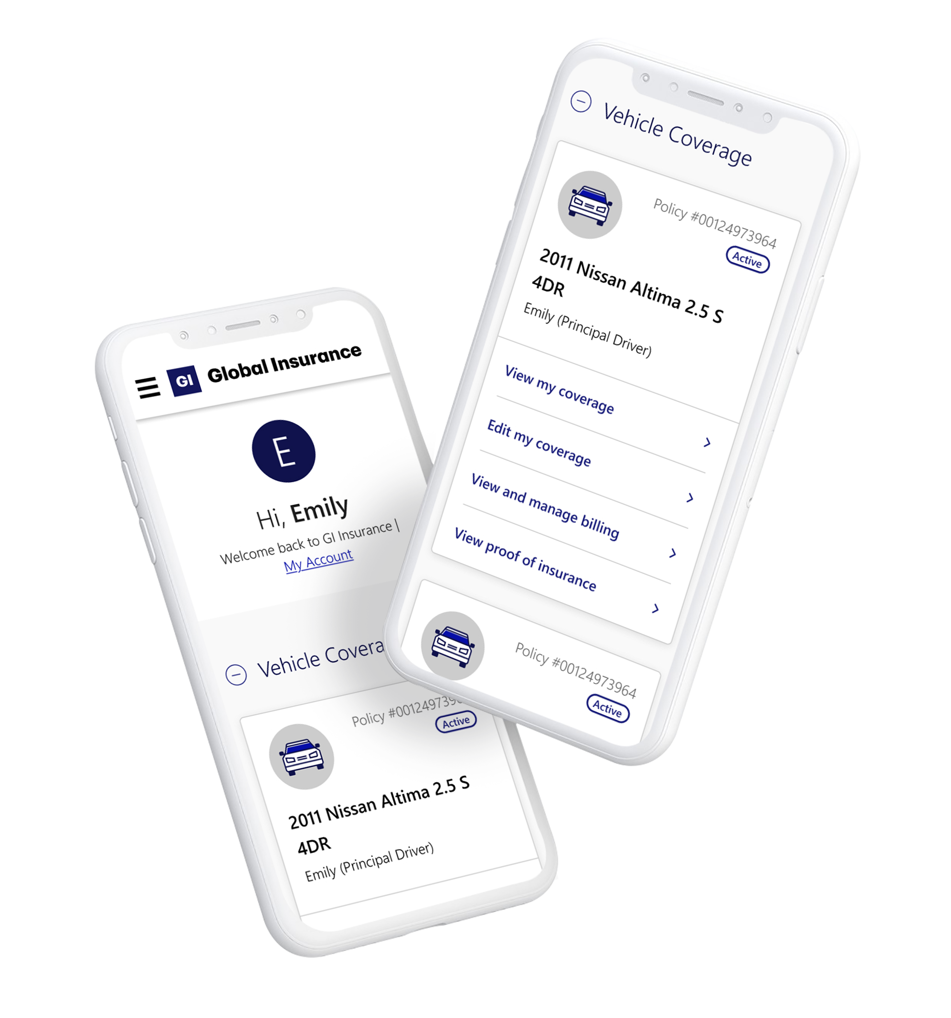
Full case study is password-protected. Request Access here