INSURANCE / FINANCIAL SERVICES
Managing insurance shouldn’t be this hard.
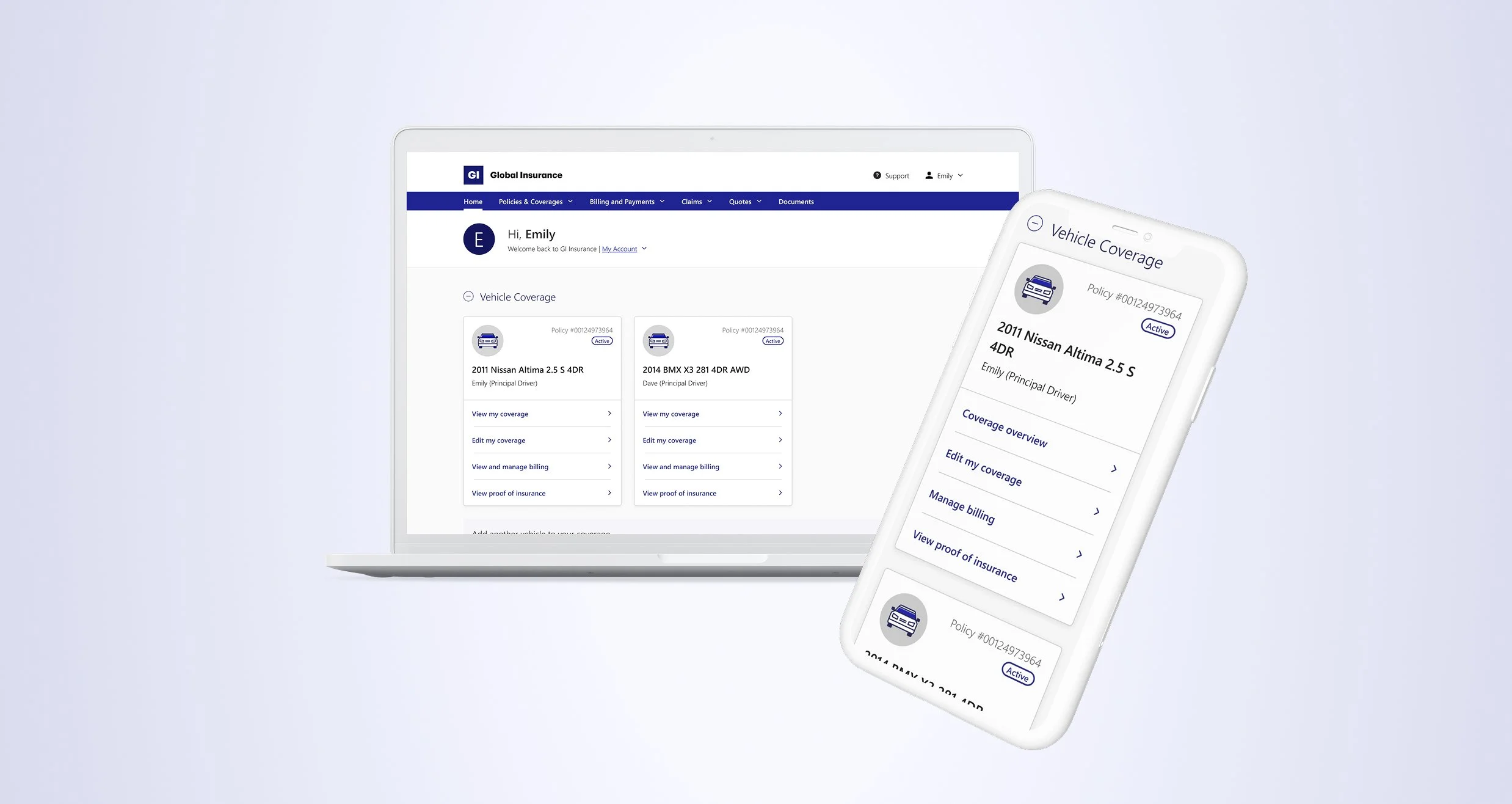
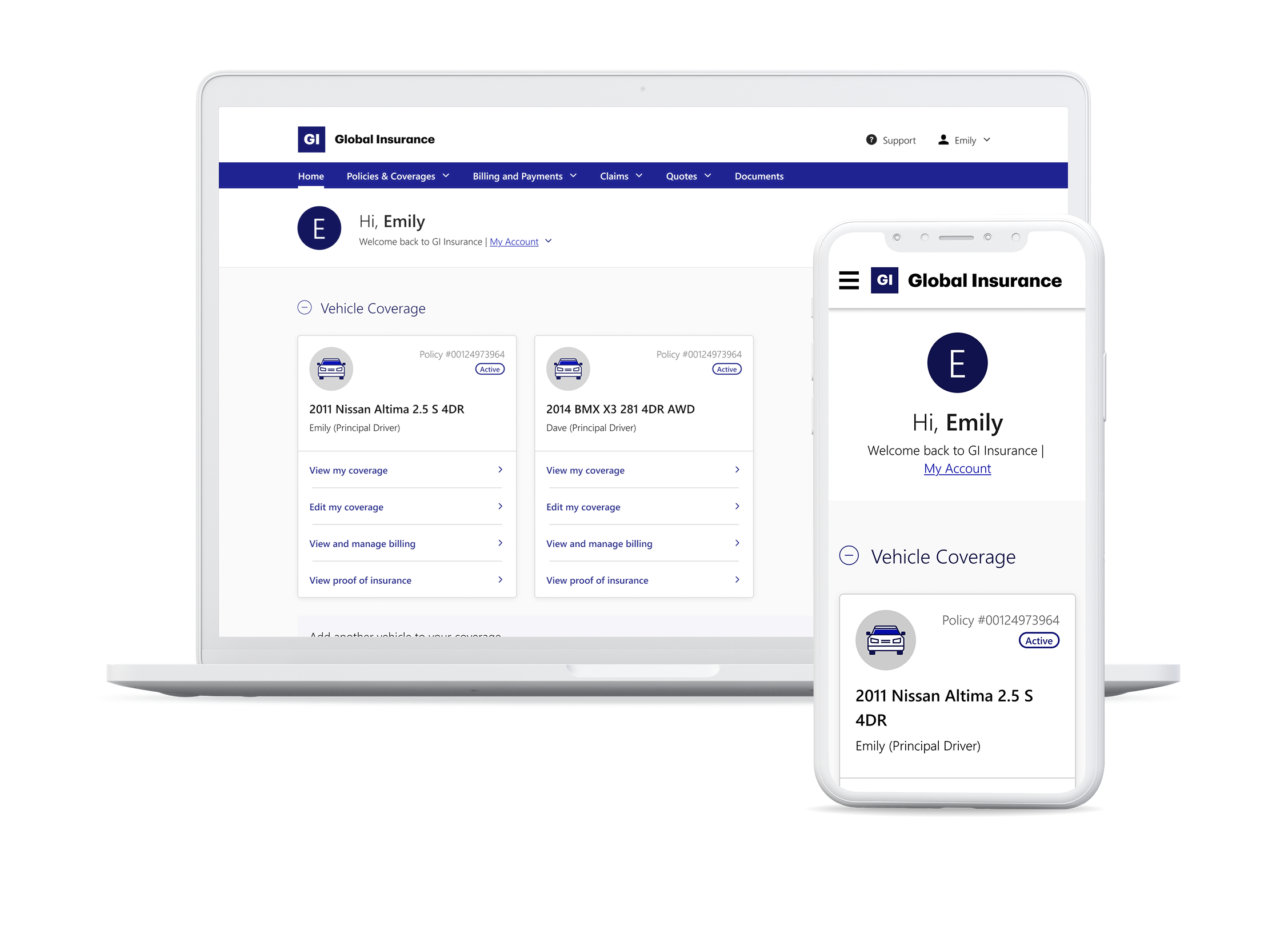
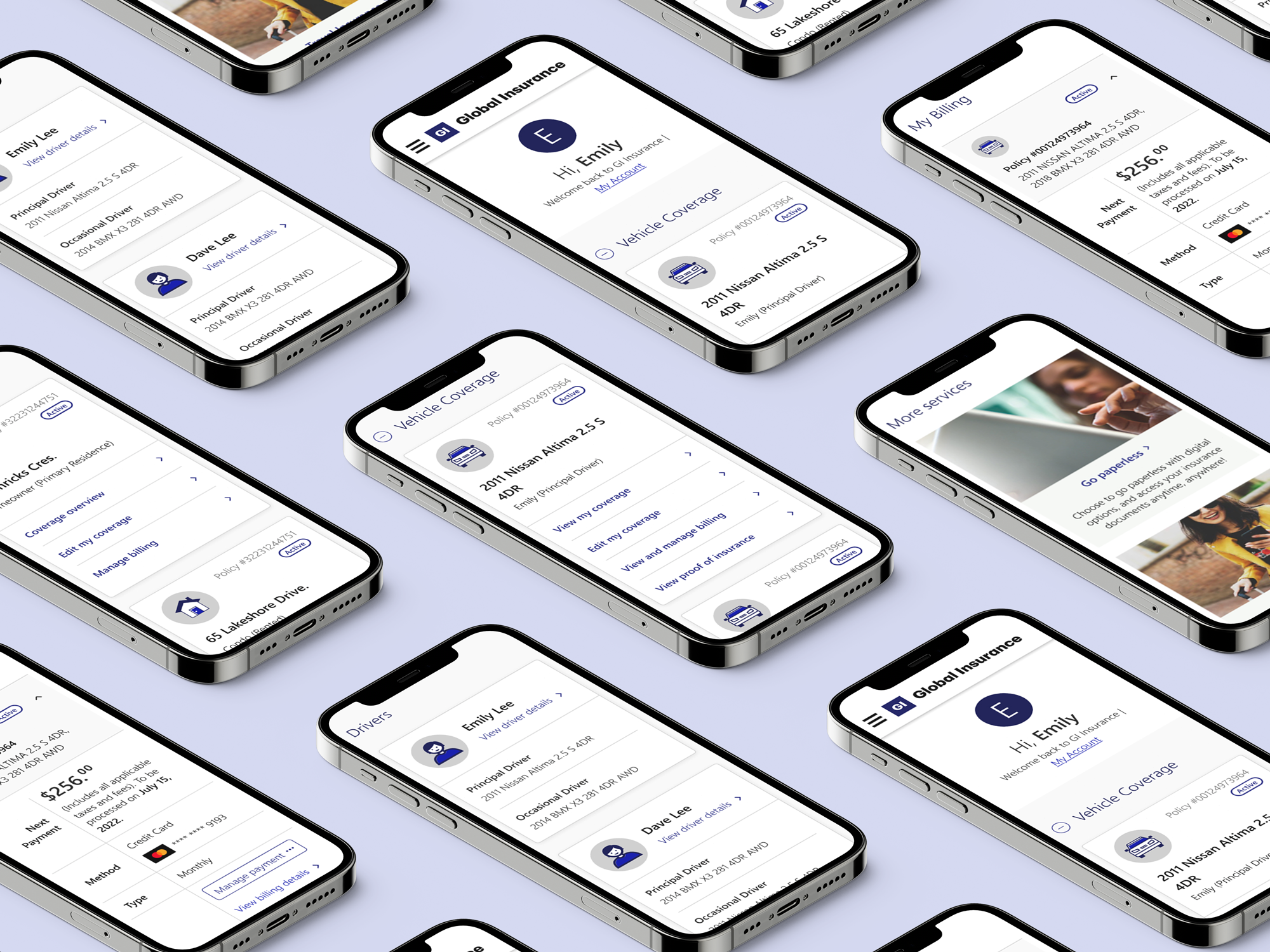
A transformed and intuitive dashboard, designed to give customers control over their insurance plans, minimize confusion, and reduce the need for support calls.
Overview
Problem
Insurance can be overwhelming, with complex jargon and cluttered interfaces making it hard for customers to manage their plan. The client, a leading Canadian insurer, recognized the need for simplification. Their old dashboard made it difficult to access key actions like reviewing coverage or updating policies, leading to frustration, abandoned tasks, and increased reliance on phone support. The business needed a solution to empower customers to self-serve confidently.
Solution
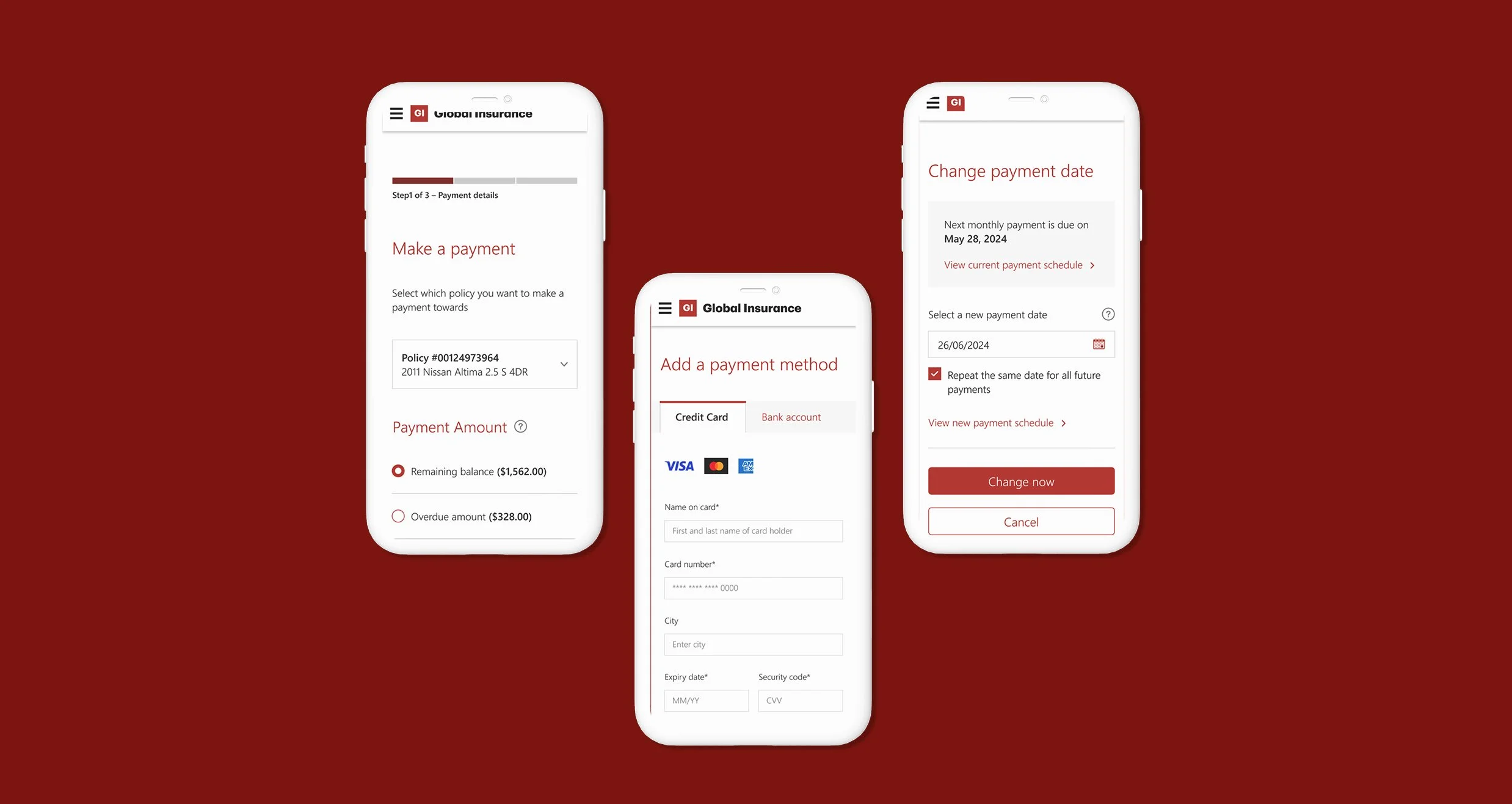
The redesigned dashboard empowers customers to confidently self-serve, reducing the need for support calls. Key tasks like managing policies, making changes, and updating coverage were simplified, offering users a seamless experience. By organizing content into clear sections, consolidating actions into intuitive CTAs, and optimizing for mobile, the dashboard is now both intuitive and user-focused.
My role & responsibilities
Lead UX Designer
Strategy & planning, Workshop facilitation, Cross-functional stakeholder management, Information architecture, User journeys and flows, Design reviews, Wireframes for design handoff.
Duration
March – October 2022
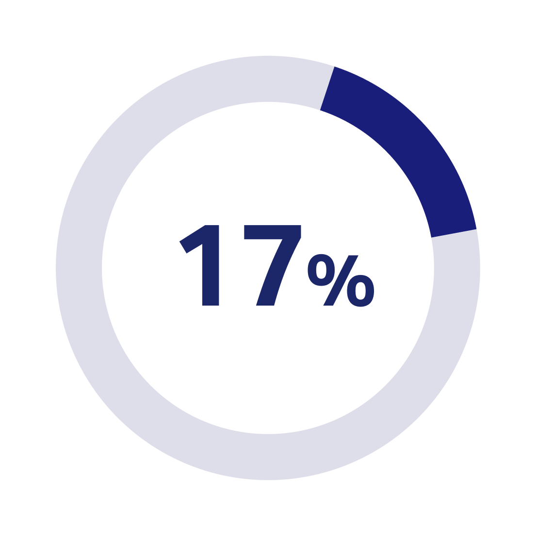
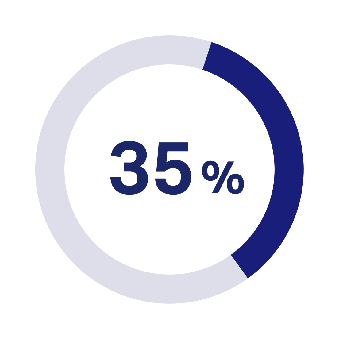
Impact post launch
Increase in digital share, i.e. transactions completed online reducing the reliance on support channels
Increase in login rate reflecting higher user engagement
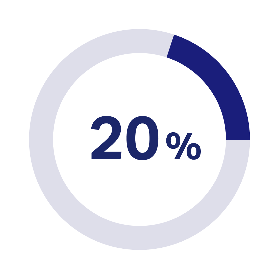
Increase in registration rate demonstrating improved customer confidence and adoption

Unpacking the problem space
Poor way-finding and cluttered information made navigation a challenge
The lack of clear organization and grouping of related content made it difficult for customers to find key information, causing frustration.
Lack of hierarchy in CTAs made it difficult for customers to complete tasks
Scattered CTAs with no clear distinction between primary and secondary actions left customers unsure how to complete the task on hand, leading to confusion and delays.
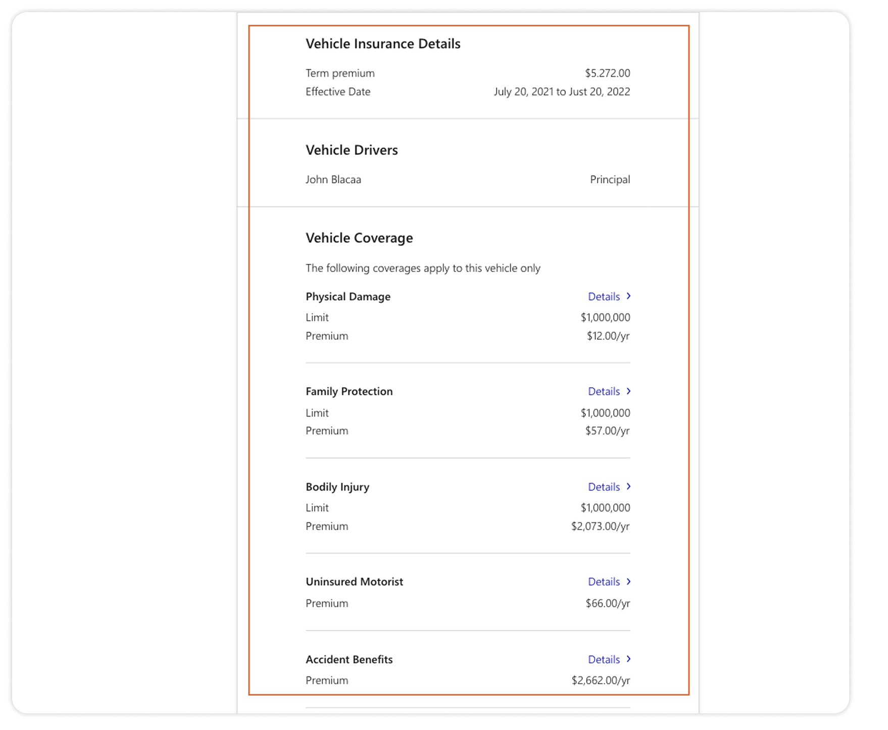
Display of extensive policy details increased cognitive load
Instead of offering summary-level information with easy pathways to detailed content, the old dashboard presented in-depth policy details up front, making it overwhelming.
Key solutions
How can customers easily find what they are looking for?
Key design decisions:
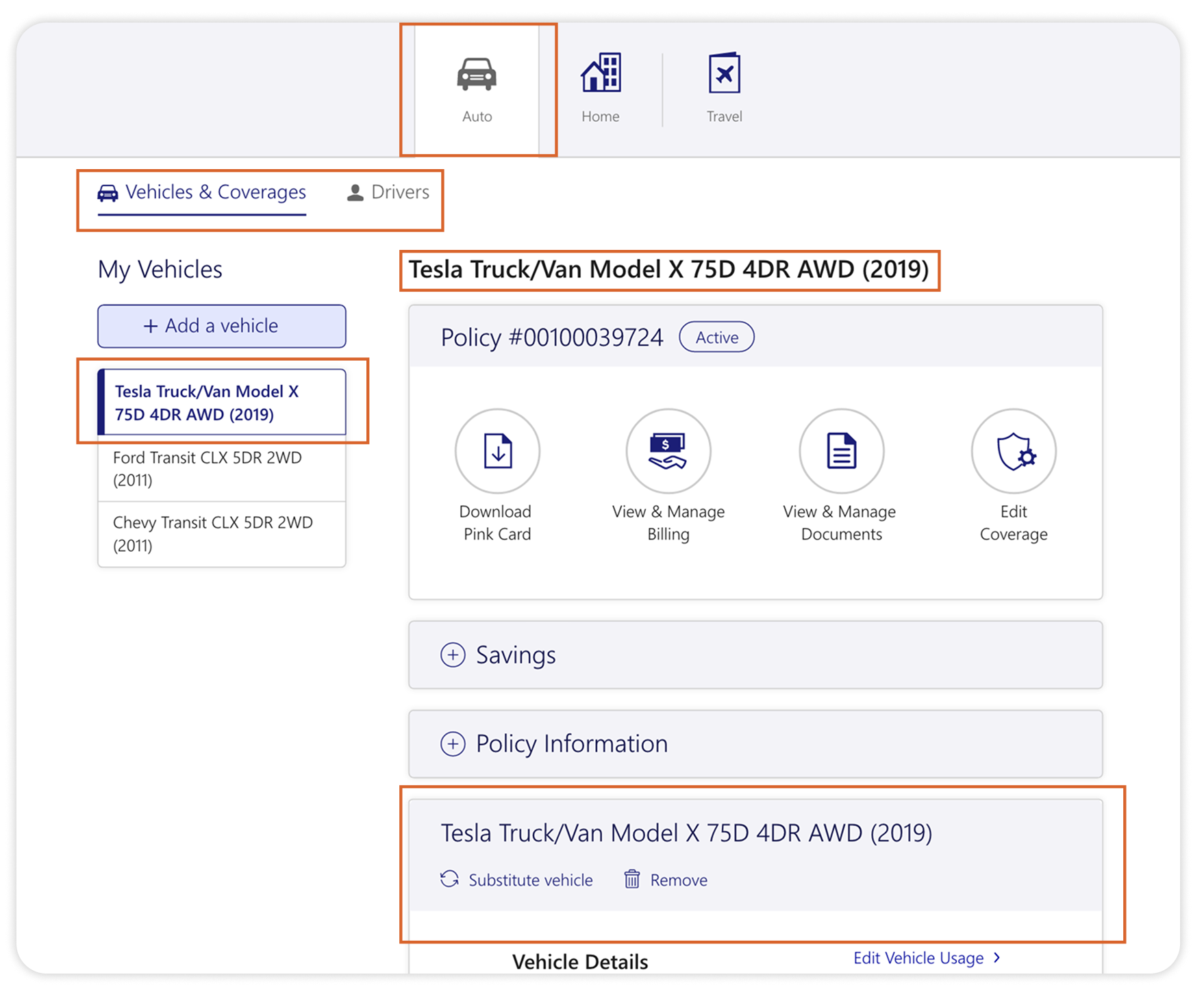
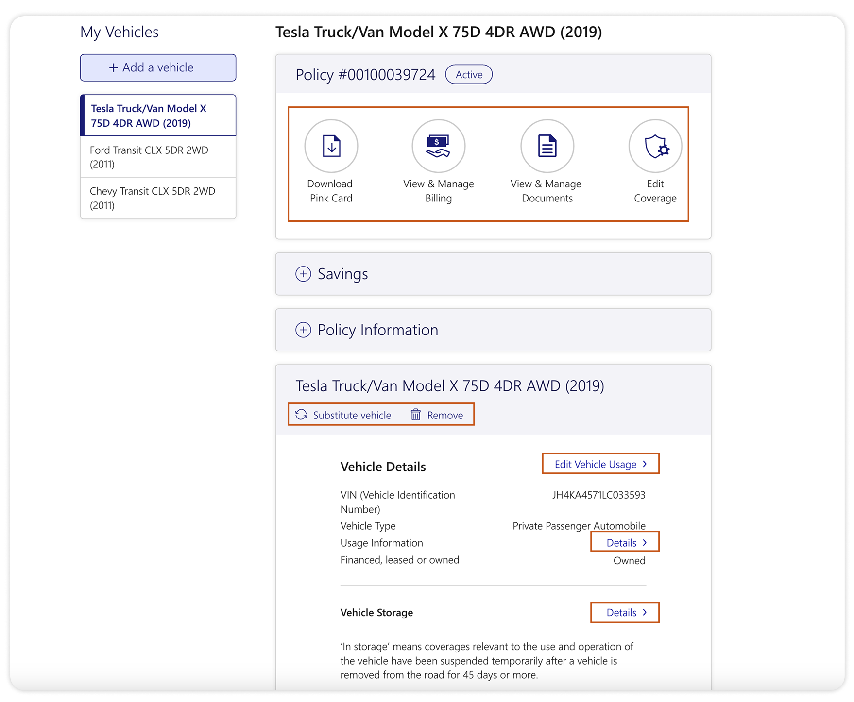
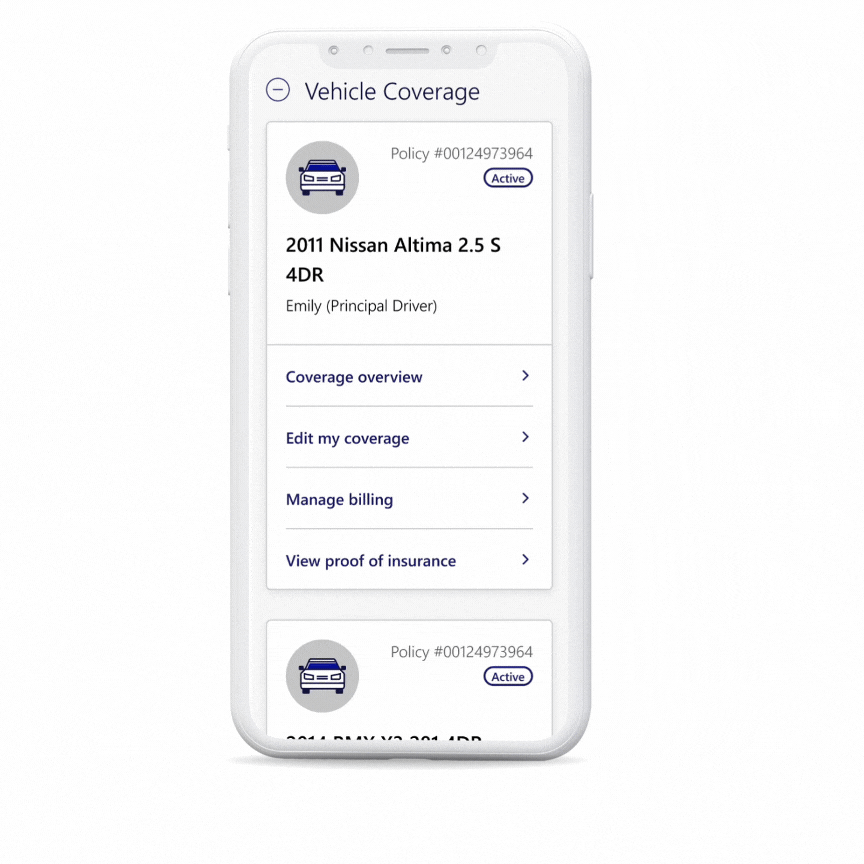
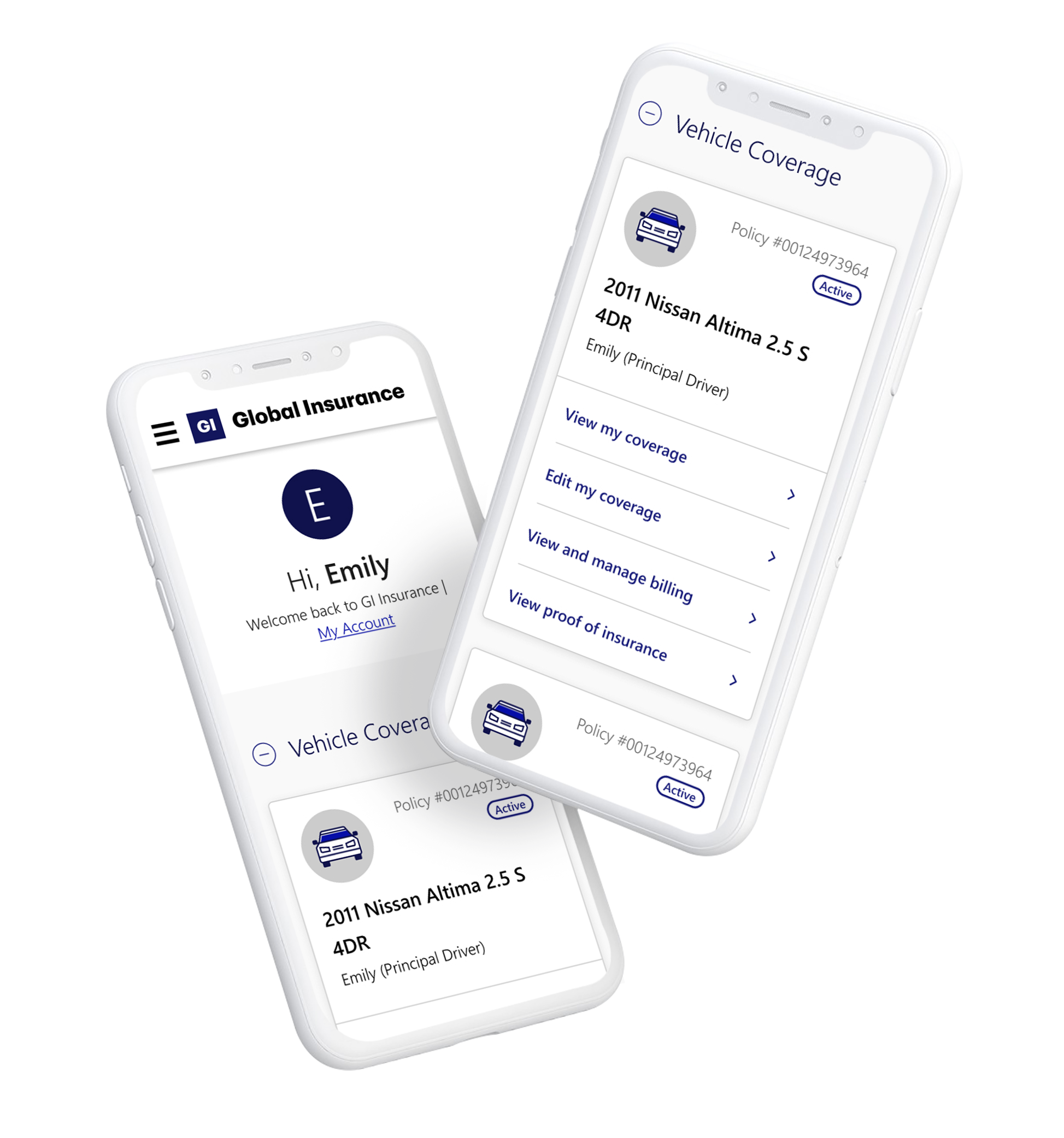
Grouped related content into clear sections, (“Vehicle Coverage,” “Home Coverage,” “My Billing”) ensuring easy navigation
Led with recognizable product names (vehicle names, home addresses) instead of policy numbers for instant recognition.
Used collapsible accordions for expandable content to keep the dashboard organized.
How can customers easily take action and complete tasks on hand?
Key design decisions:
Consolidated primary actions (e.g., “View my coverage,” “Change coverage”) into prominent, easily accessible links.
Positioned critical tasks in prominent position (e.g., Download pink card) to guide customers through key actions efficiently.
Streamlined tasks by focusing on a limited number of clear actions per section, reducing cognitive load.
How can we reduce cognitive overload and present key information without overwhelming customers?
Key design decisions:
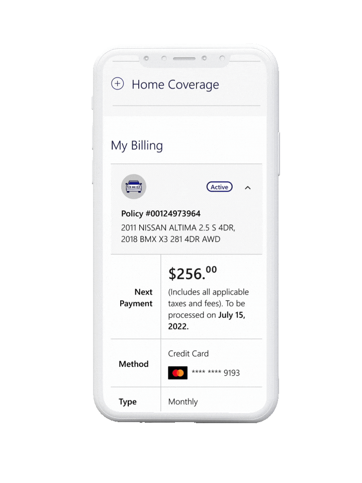
Displayed summary-level information (e.g., billing totals, upcoming payments) to minimize visual clutter.
Provided clear pathways to detailed content (e.g., policy details, claims) through links and expandable sections.
Differentiated primary CTAs from secondary ones using size, color, and placement for immediate recognition.
Challenges & Opportunities
While the project was executed holistically, its cross-functional nature brought several challenges. Here’s how I overcame them:
Incomplete or missing requirements despite Agile methodology
The design team frequently faced incomplete or evolving requirements, which impacted planning and execution, especially when new requirements surfaced after design approval.
Solutions:
-
I took the lead on gathering requirements through frequent collaborative workshops with stakeholders, revealing business goals, technical dependencies, and constraints.
-
I started with what was clear, presenting early drafts to visualize the experience and fill gaps in understanding.
-
I created a project plan independent of the dev team's timeline, staying 2-3 sprints ahead to allow time for adjusting to changes in requirements.
Back-end constraints
Working with legacy systems created numerous back-end limitations that restricted how we could implement certain features.
Solutions:
-
I involved the back-end teams early and often to understand technical possibilities, risks, and dependencies, ensuring informed design decisions.
-
Where changes were not feasible due to back-end constraints, I flagged customer experience risks to the business teams and annotated wireframes to ensure visibility.
-
We designed for current technical constraints in the first MVP, placing less critical features on the backlog for future prioritization.
In conclusion
This project transformed a traditionally complex and frustrating experience into a streamlined, self-service platform that empowers customers. By focusing on clarity, simplicity, and usability, the redesigned dashboard made managing insurance easier and more accessible.
The impact was immediate, with increased transactions, higher engagement, and greater customer satisfaction. Moving forward, the design serves as a strong foundation for continuous improvements, with future enhancements already on the roadmap. This project reinforced the importance of cross-functional collaboration and maintaining a user-centric approach throughout the design and implementation process.
View other projects
Streamlined billing for effortless self-service.
A fresh take on the Seiko eyewear experience.